WPF开发随笔收录-带递增递减按钮TextBox
一、前言
今天分享一下如何实现带递增递减按钮的TextBox控件
二、正文
1、之前的博客分享了一篇自定义XamlIcon控件的文章,这次就直接在那个项目的基础上实现今天这个自定义控件
2、首先添加两个图标资源,一个增加的按钮,一个减小的按钮,具体过程可以参考我之前写的文章
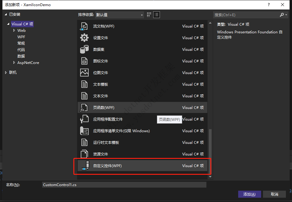
3、接着新增一个自定义控件,如图所示那个
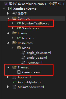
4、添加后,项目中还会生成一个Themes文件夹,里面还有一个Generic.xaml的文件,这个文件可以用来写控件样式的,里面会自动生成一个最基础的控件样式,而那个NumberTextBox是用来后后台逻辑的
5、先来把控件的样式编写一下,如下,样式具体细节就不在描述,就是在里面添加了两个自定义的XamlIcon控件来作为递增和递减按钮,然后还添加了一个TextBlock来做提示文本
<Style TargetType="{x:Type ctls:NumberTextBox}">
    <Setter Property="Cursor" Value="IBeam" />
    <Setter Property="FocusVisualStyle" Value="{x:Null}" />
    <Setter Property="Foreground" Value="#555" />
    <Setter Property="VerticalAlignment" Value="Center" />
    <Setter Property="Template">
        <Setter.Value>
            <ControlTemplate TargetType="{x:Type ctls:NumberTextBox}">
                <Border
                    Name="Border"
                    Background="White"
                    BorderBrush="#AAA"
                    BorderThickness="1"
                    CornerRadius="3">
                    <Grid>
                        <Grid.ColumnDefinitions>
                            <ColumnDefinition />
                            <ColumnDefinition Width="30" />
                        </Grid.ColumnDefinitions>
                        <ScrollViewer
                            x:Name="PART_ContentHost"
                            Margin="6,0,0,0"
                            VerticalAlignment="{TemplateBinding VerticalAlignment}"
                            Focusable="false"
                            HorizontalScrollBarVisibility="Hidden"
                            VerticalScrollBarVisibility="Hidden" />
                        <TextBlock
                            x:Name="Hint"
                            Margin="6,0,0,0"
                            VerticalAlignment="{Binding ElementName=PART_ContentHost, Path=VerticalAlignment}"
                            Foreground="#c9ccd7"
                            Text="{TemplateBinding Tag}"
                            Visibility="Collapsed" />
                        <Border
                            Grid.Column="1"
                            Background="Transparent"
                            BorderBrush="#eee"
                            BorderThickness="1,0,0,0">
                            <Grid>
                                <Grid.RowDefinitions>
                                    <RowDefinition />
                                    <RowDefinition Height="Auto" />
                                    <RowDefinition />
                                </Grid.RowDefinitions>
                                <ctls:XamlIcon
                                    x:Name="InButton"
                                    VerticalAlignment="Center"
                                    Cursor="Hand"
                                    Icon="angle_up" />
                                <Rectangle
                                    Grid.Row="1"
                                    Height="1"
                                    Fill="#eee" />
                                <ctls:XamlIcon
                                    x:Name="DeButton"
                                    Grid.Row="2"
                                    VerticalAlignment="Center"
                                    Cursor="Hand"
                                    Icon="angle_down" />
                            </Grid>
                        </Border>
                    </Grid>
                </Border>
                <ControlTemplate.Triggers>
                    <Trigger Property="Text" Value="{x:Null}">
                        <Setter TargetName="Hint" Property="Visibility" Value="{x:Static Visibility.Visible}" />
                    </Trigger>
                    <Trigger Property="Text" Value="">
                        <Setter TargetName="Hint" Property="Visibility" Value="{x:Static Visibility.Visible}" />
                    </Trigger>
                </ControlTemplate.Triggers>
            </ControlTemplate>
        </Setter.Value>
    </Setter>
</Style>
6、接着就是编写后台部分代码,后台部分代码也比较简单,这里简单的添加了两个依赖属性,一个是递进值,一个是最小值。然后就是在OnApplyTemplate的重载中去给样式那里添加的两个控件添加鼠标点击事件。就先这样基础的实现先,复杂的功能后续在增加进去,比如限制只能输入数字之类的,今天主要先介绍实现的大致方法。
public class NumberTextBox : TextBox
{
    public int Step
    {
        get { return (int)GetValue(StepProperty); }
        set { SetValue(StepProperty, value); }
    }

    public static readonly DependencyProperty StepProperty =
        DependencyProperty.Register("Step", typeof(int), typeof(NumberTextBox), new PropertyMetadata(1));

    public int Minimum
    {
        get { return (int)GetValue(MinimumProperty); }
        set { SetValue(MinimumProperty, value); }
    }
    public static readonly DependencyProperty MinimumProperty =
        DependencyProperty.Register("Minimum", typeof(int), typeof(NumberTextBox), new PropertyMetadata(0));

    static NumberTextBox()
    {
        DefaultStyleKeyProperty.OverrideMetadata(typeof(NumberTextBox), new FrameworkPropertyMetadata(typeof(NumberTextBox)));
    }

    public NumberTextBox()
    {
        InputMethod.SetIsInputMethodEnabled(this, false);
    }

    public override void OnApplyTemplate()
    {
        base.OnApplyTemplate();
        XamlIcon DeButton = (XamlIcon)this.Template.FindName("DeButton", this);
        XamlIcon InButton = (XamlIcon)this.Template.FindName("InButton", this);

        DeButton.MouseLeftButtonDown += DeButton_MouseLeftButtonDown;
        InButton.MouseLeftButtonDown += InButton_MouseLeftButtonDown;
    }

    private void DeButton_MouseLeftButtonDown(object sender, MouseButtonEventArgs e)
    {
        if (!String.IsNullOrEmpty(this.Text))
        {
            this.Text = int.Parse(this.Text) - Step < Minimum ? Minimum + "" : int.Parse(this.Text) - Step + "";
            this.SelectionStart = this.Text.Length;
        }
        else
        {
            this.Text = Minimum + "";
            this.SelectionStart = this.Text.Length;
        }
    }

    private void InButton_MouseLeftButtonDown(object sender, MouseButtonEventArgs e)
    {
        if (!String.IsNullOrEmpty(this.Text))
        {
            this.Text = int.Parse(this.Text) + Step + "";
            this.SelectionStart = this.Text.Length;
        }
        else
        {
            this.Text = Minimum + "";
            this.SelectionStart = this.Text.Length;
        }
    }
}
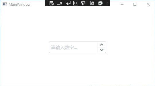
7、测试控件功能,主界面添加自定义好的控件,如下
<Window x:Class="XamlIconDemo.MainWindow"
        xmlns="http://schemas.microsoft.com/winfx/2006/xaml/presentation"
        xmlns:x="http://schemas.microsoft.com/winfx/2006/xaml"
        xmlns:d="http://schemas.microsoft.com/expression/blend/2008"
        xmlns:ctls="clr-namespace:XamlIconDemo.Controls"
        xmlns:mc="http://schemas.openxmlformats.org/markup-compatibility/2006"
        xmlns:local="clr-namespace:XamlIconDemo"
        mc:Ignorable="d"
        Title="MainWindow" Height="450" Width="800">
    <Grid>
        <ctls:NumberTextBox
            Width="200"
            Height="40"
            FontSize="22"
            Minimum="0"
            Step="5"
            VerticalAlignment="Center"
            HorizontalAlignment="Center"
            Tag="请输入数字..."/>
    </Grid>
</Window>
8、实现效果如下,基础功能已经算实现了,但还不完善,有需要的可以自己完善完善,今天的分享就到这了
文章来源:https://www.cnblogs.com/cong2312/p/15747254.html
版权声明:本文为YES开发框架网发布内容,转载请附上原文出处连接
CSharp 管理员