CSS鼠标hover 背景动画煽动效果
纯CSS鼠标hover实现背景动画效果
CSS鼠标Hover背景动画煽动效果
CSS鼠标Hover背景动画效果
实现效果
CSS鼠标Hover背景动画效果:对角线扩展煽动效果

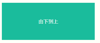
CSS鼠标Hover背景动画效果:从下到上扩展煽动效果
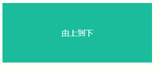
CSS鼠标Hover背景动画效果:从上到下扩展煽动效果
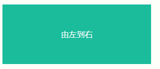
CSS鼠标Hover背景动画效果:从左到右扩展煽动效果
CSS鼠标Hover背景动画效果:从右到左扩展煽动效果

实现源码
HTML 全选
<!doctype html>
<html>
<head>
    <meta charset="utf-8">
    <title>纯CSS鼠标hover实现背景扇动效果</title>
    <style>
        .la-btn {
            color:#fff;
			background:#1abc9c;
			width:300px;
			height:120px;
			line-height:120px;
			text-align:center;
			cursor:pointer;

            overflow:hidden;
            transition:all .35s;
            display:inline-block;
            position:relative;
            z-index:1;
        }

		.gz-animate-background {
			position: relative;
			overflow: hidden;
			z-index: 1
		}

		.gz-animate-background-dark-up:before {
			position: absolute;
			width: 100%;
			height: 100%;
			left: 0;
			top: 100%;
			visibility: hidden;
			background: #00000080;
			content: "";
			z-index: -1;
			transition: all .35s
		}

		.gz-animate-background-dark-up:hover:before {
			visibility: visible;
			top: 0
		}

		.gz-animate-background-dark-down:before {
			position: absolute;
			width: 100%;
			height: 100%;
			left: 0;
			top: -100%;
			visibility: hidden;
			background: #00000080;
			content: "";
			z-index: -1;
			transition: all .35s
		}

		.gz-animate-background-dark-down:hover:before {
			visibility: visible;
			top: 0
		}

		.gz-animate-background-dark-left:before {
			position: absolute;
			width: 100%;
			height: 100%;
			left: 100%;
			top: 0;
			visibility: hidden;
			background: #00000080;
			content: "";
			z-index: -1;
			transition: all .35s
		}

		.gz-animate-background-dark-left:hover:before {
			visibility: visible;
			left: 0
		}

		.gz-animate-background-dark-right:before {
			position: absolute;
			width: 100%;
			height: 100%;
			left: -100%;
			top: 0;
			visibility: hidden;
			background: #00000080;
			content: "";
			z-index: -1;
			transition: all .35s
		}

		.gz-animate-background-dark-right:hover:before {
			visibility: visible;
			left: 0
		}


		.gz-animate-background-dark-45:before{
			position: absolute;
			width: 0;
			height: 100%;
			left: 50%;
			top: 0;
			visibility: hidden;
			background: #00000080;
			content: "";
			z-index: -1;
			transform:skew(45deg,0);
			transition: all .35s
		}
		.gz-animate-background-dark-45:hover:before {
			visibility:visible;
            width:150%;
            left:-25%;
		}


    </style>
</head>
<body>
<div class="">
<div href="#" class="la-btn gz-animate-background gz-animate-background-dark-45">对角线扩展</div>

<div href="#" class="la-btn gz-animate-background gz-animate-background-dark-up">由下到上</div>

<div href="#" class="la-btn gz-animate-background gz-animate-background-dark-down">由上到下</div>

<div href="#" class="la-btn gz-animate-background gz-animate-background-dark-right">由左到右</div>

<div href="#" class="la-btn gz-animate-background gz-animate-background-dark-left">由右到左</div>

</div>

</body>
</html>
参考:
Hover.css 是一套基于 CSS3 的鼠标悬停效果和动画,这些可以非常轻松的被应用到按钮、LOGO 以及图片等元素。所有这些效果都是只需要单一的标签,必要的时候使用 before 和 after 伪元素。因为使用了 CSS3 过渡、转换和动画效果,因此只支持 Chrome、Firefox 和 Safari 等现代浏览器。
版权声明:本文为YES开发框架网发布内容,转载请附上原文出处连接
post 管理员